 If there's one part of the art-making process that's really important, it's composition.
Color, light and shading, good supplies... They're are all helpful. But the composition can make or break your art!
When an artist or critic first looks at a piece of art, they see the art as a whole. But the composition is what causes the eye to linger, taking in color, technique, and meaning.
Sooo yeah, blah blah blah, composition this and composition that...
What exactly is composition?
I know, you hear that word and think of English classes! Composition in art refers to the way the subject is arranged on the canvas. It's the strategy, or game plan, in a great painting. Composition is about guiding the eyes to the most important part of the piece.
What exactly is composition?
I know, you hear that word and think of English classes! Composition in art refers to the way the subject is arranged on the canvas. It's the strategy, or game plan, in a great painting. Composition is about guiding the eyes to the most important part of the piece.
Today I want to talk about the four most basic, and most important, composition strategies. I said "rules" in the title, and they're sometimes called that, but really, this isn't about hard-and-fast rules you must follow to make good art. These are tools, guidelines. But, they're guidelines that you'll find in some of the best art in the world, so there must be something to 'em, right?
I've had these hammered into me since my 4th or 5th grade art classes, and they've gradually become almost second-nature to me. They're tools you'll find in almost every painting (except a few modern pieces, maybe), because they're just so good. We're talking about the difference between a painting of potted plant and Vincent van Gogh's Sunflowers. It's basically magic... Or psychology.
I've had these hammered into me since my 4th or 5th grade art classes, and they've gradually become almost second-nature to me. They're tools you'll find in almost every painting (except a few modern pieces, maybe), because they're just so good. We're talking about the difference between a painting of potted plant and Vincent van Gogh's Sunflowers. It's basically magic... Or psychology.
Are you ready? Drum roll please....................
 1. The Rule of Thirds
Let me show you with a sketch I did a while back, planning out a collage.
Side note: this sketch is for a collage inspired by "On the Pulse of Morning" by Maya Angelou. You should read it because it's wonderful, and is really important for racial equality. Okay, back to the regularly scheduled programming!
The rule of thirds means that if you divide the drawing into thirds both horizontally and vertically, the main elements of the drawing should correspond with the lines and intersections of that grid.
 I know, I know. You're an artist! A visual thinker! Let's take a look. To the right, I've drawn a few guidelines on my sketch. The red grid is the thirds I'm talking about. It's all about those red lines, my people!
I've circled the features that I'm talking about in different colors. If you notice, each of these features lies either along a red line, or sits on an intersection.
The dark blue, for example, is a big limb of the tree. See how that big section of tree limb lies along the that top horizontal line?
Then it meets the trunk, circled in green, at the second vertical line.
The horizon in its yellow circle is next, on the bottom horizontal line.
Finally, this is where we really get going. When an element is at an intersection, you know it's important. I put the rock there at the bottom left intersection, circled in aqua, because it's an important part of the On the Pulse of Morning. And opposite that, on the top right intersection, is the main part of the tree, circled in pink.
2. Triangles.
Triangles are a really great tool in composition. They're visually pleasing, pulling the eye in to examine each point of interest within the triangular space. You notice how your eye wants to linger on the tree and the rock, not on the sky or the rest of the ground? That's because the tree and the rock create a triangular space for the eye to pause and examine.
 Next time you look at a great painting, see what imaginary triangles you can find, connecting or enveloping points of focus within the image. Pretty soon, you'll be a pro at finding those ever-important triangles!
These triangles go hand in hand with the next composition tool...
3. Balance.
Look at that top left intersection. There's not much going on. In fact, there's not much going on in that whole top left area, outlined in purple. That's where balance comes in. When you have a large area that is relatively unused like that, it can create a sense of balance.
3. Balance.
Look at that top left intersection. There's not much going on. In fact, there's not much going on in that whole top left area, outlined in purple. That's where balance comes in. When you have a large area that is relatively unused like that, it can create a sense of balance.
The green triangle is the focal point. The calm, quiet purple triangle balances out the green triangle and allows it to be the focal point.
Next time you look at a painting, try to note patterns or asymmetry between busy areas and empty space. You might be surprised to see how the tension plays out between focal point and empty space.
4. Movement
Maybe more specifically, lead-in lines. These diagonals imply movement, and cause our eyes to move toward the focal point. Want your focal point to really stand out? Arrange linear elements diagonally, moving the eye toward the focal point. Next time you see a photo of a landscape with a road cutting through it, notice how your eye naturally follows the road. Or, in my sketch above, notice the shadow of the rock and the shadow of the tree serving as lead-in lines, pulling your eyes in to the image.
Okay, soooo now that you're probably feeling overwhelmed with all these colors and triangles and circles, let's look at some famous art. After mentioning him earlier, I'm definitely in a Vincent van Gogh mood! In fact, the texture of his painting style, with those big, directional brush strokes that act like lead-in-lines, has so much movement that it really emphasizes all the composition stuff we're talking about here.
Example 1:

This is Starry Night Over the Rhone, one of my favorites by Van Gogh. It's a great example of the rule of thirds.
The orange lines are our thirds, but you can probably see the general lines in the painting itself!
 Circled in blue is that line of lights in the background, on the top horizontal line. These serve to pull the eye in, and to balance the painting, before sending the eye toward the couple.
The reflections in the water guide the eye down to the triangular piece of land at the bottom, to reach the couple standing in the bottom right section (circled in aqua).
The diagonal brushstrokes along the lower left side also serve to "sweep" the eye toward the couple.
You see? It's not really that complicated, huh?
Shall we try analyzing one more? I'm in if you're in!
 Example 2:
This is a slightly less well-known painting by Van Gogh, called The Round of the Prisoners. It's actually a copy of a painting by Gustave Doré.
Side note: want to get really good at art? Copy the masterpieces! Dig in deep and get to know the artist, why he/she painted the piece, the technique, and what makes it such a compelling piece.
I love the original, but like I said earlier, Van Gogh's brushstrokes further emphasize the movement and the beautiful composition of this piece. Let's add some lines and circles for a closer look, shall we?
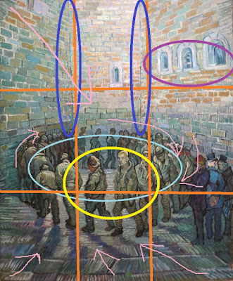 Once again, the orange lines are our thirds. Starting at the top, the two lines where the walls meet lie almost perfectly on the thirds!
Next is the set of windows circled in purple, which serve to balance out the composition so there's not a huge blank space on the entire upper third. When there's a really strong focal point, it's good to balance that weight with some light detailing in the "empty" space. Doré and Van Gogh handle that really well here.
Moving down, the prisoners create a great circular element so the eyes are drawn down the walls, around the aqua circle, to the focal point of the prisoners in the yellow circle.
The directional strokes in the floor, along with the slant of the walls, act as the lead-in lines to help bring the eye toward that focal point in the lower center.
This composition is so successful because it takes all of these tools into account. Doré didn't chop his painting into half with a horizon across the middle, he kept things in thirds. Look at the triangles created by the shadows of the prisoners: those aren't accidental. He didn't just start painting, he planned. When Van Gogh copied it, he found he could give it even more movement by angling the lines on the flooring to be lead-in lines. Such an awesome composition!

Well, that pretty much wraps up what I've got to say about composition, at least for now. But, here's one last painting that should be pretty familiar to you, since it's boomed in popularity in recent years.... Van Gogh's Starry Night.
Try finding all of those elements we've talked about—thirds, triangles, balance, movement—to analyze the composition. Then, break out your pencils and paints and try using what you've learned! You'll know you have a strong composition when you can trace a path around the image for the eyes to reach the focal point. Keep your thirds strong and utilize those triangles and diagonals to create balance and movement.
I'd love to see what you come up with!
-Cailey
No comments:
Post a Comment