Showing posts with label Vincent Van Gogh. Show all posts

Saturday, May 22, 2021

Cailey's Back: Wheat and Sunflowers, Changes and Mistakes

After about a year off blogging, ya girl is back! Last year was probably the craziest year ever. I know,  I don't even need to go into all that, it was a crazy year for everyone. But seriously. I'll share more later but let me just give you the cliff notes: 

Nick and me dancing at our
wedding!
In January 2020 I was happily single, living in my parent’s house, working full-time, planning a visit to Kherson, Ukraine, and enjoying my best mental health in years. 

Things were looking good, I was a few months away from paying off student loans, hoping to move into my own place by the end of the year, and working on an October deadline to publish a poetry novel.

By December I was engaged, had a new sister and a new nephew, had spent April and most of May off work for quarantine, I was finally getting ready to move into an apartment, I'd paid off my loans and completed my book, and was still enjoying my best mental health (aside from the stress of planning a wedding during a deadly pandemic!). 

With everything going on last year, adopting a sister and dating during a pandemic and whatnot, something had to give... so this site drew the short straw.

Now I'm happily married, happily vaccinated, and ready to come back to See Cailey Color!

It seems right to begin with a painting that, like this blog, also sat dormant for a year:

Wheat and Sunflowers, May 2021. Acrylic and gold ink on canvas, 14"x18". 

Early in the process...

Like I said, I planned to go to Ukraine for a week at the end of June last year. 

I got my passport, our group purchased plane tickets and started learning about the culture, everything was on track for us to travel... 

Of course you already know that didn’t happen. Covid-19 threw a major wrench in everyone's plans. 

When I began making arrangements for the trip, I did some research on the country, planning to make a painting inspired by what I learned. Wheat and sunflower oil are two of Ukraine's largest exports, and the area we were going to is very agricultural. 

I've always loved sunflowers and the color yellow... Toss in a shameless obsession with Vincent Van Gogh, and this painting just had to happen!

So I spent hours googling images of sunflower fields and wheat fields, considering my composition and colors, and thinking about techniques. 

Check out that empty foreground, waiting for inspiration!

I wanted to use a paint brush as little as possible on this one, so I used a painting knife for the underpainting and and the sky, and a sponge to paint much of the sunflower field. I only used a brush on the sunflower details and the wheat!

Anyway, coronavirus reared its ugly head, the trip was cancelled, plane tickets refunded, and my painting slipped to the sidelines. It was almost finished except for a strip of foreground that I just couldn’t get right.

The painting sat in a stack of unfinished work for a long time. I was seriously stuck on that foreground. I loved what I'd done with it thus far, especially with the sunflower field, but I just couldn't work it out.

Finally, just few weeks ago I decided I wanted to finish the painting. Feeling determined but still not exactly inspired, I made a big mistake by attempting to add a large pine tree to the foreground, with the trunk stretching up the right side and branches arching across the top, neatly framing the sunflower and wheat fields. 

I didn't even want to show you this picture but I felt
obligated to share my shame...

My gut told me not to, but I was stubborn and added that darn tree.

I hated it with the first brushstrokes, but I just kept painting and painting, like a mad woman. 

By the time I finally put down my brush, I was stuck with this very ugly tree marring the whole right side of the canvas. It was awful. I hated it.

I mean, look at it! That's like.... the worst thing I've ever painted. I hate it. 

Finally I put down my brush, but the damage was done and I wanted to cry. I felt like it was ruined. I was so mad at myself. 

I hated the thought of trying to go back over it and fix everything. The sunflowers would never be the same. The big puffy clouds and deep blue sky could never be fixed. I even considered cutting the unmarred rectangle from the middle of the canvas to use in a collage. 

But I didn't do anything drastic (the first thing I did right that night!). The next day, I painted back over the tree. Everything would be fine. 

It strikes me that this painting is a lot like life. Sometimes, you ignore your conscience and do the wrong thing. You know it’s wrong and stupid, you know it’s ruining everything, but you do it anyway, all the while your gut is screaming at you for being so stupid and stubborn. 

I’m thankful for a God who forgives mistakes and works things out for the best! 

Almost done!

That doesn’t mean the mistake never happened; there are always consequences. 

It's true that the sky and the sunflower field will never be the same. And I’ll always know that underneath the yellow and blue paint, there’s an ugly tree that should never have happened. 

Overall, however, the painting is actually more beautiful because it's finally finished!

June 2020 came and went and I still haven’t been to Ukraine. I have no idea if there’s a landscape like this anywhere in the country. There probably isn’t! I just know two of their main industries and enjoy using a paint knife. It’s hardly even about Ukraine anymore, but about mistakes and a hope for redemption.

Vincent van Gogh, Wheatfield with Crows, oil on canvas, 1890.
I've always loved this one. Can you tell it was big inspiration for my painting?

I still want to go to Ukraine someday and see what it actually looks like. But I’ll need to change the last name on my passport!

-Cailey Lazarus


Monday, May 15, 2017

Designing my Graduation Cap

Hey friends!

I just graduated on Saturday with my Bachelor of Arts in English. And now that I've got college graduation in my rear-view mirror, I really want to share my graduation cap with you all!


Pen and colored pencil on paper, glued to mortarboard
Leading up to graduation, my friends kept asking if I was decorating my cap. Decorating my cap? Of course! I'm an artist. Decorating the cap is basically the whole point of graduating.

I'm gonna be honest: I put a whole lot of thought into this.

I've actually been thinking about design ideas from my first discovery, several years ago, that some schools allow students to decorate their caps.

Of course, things got a little more serious in my senior year, as the big day approached. I spent a whole lot of time browsing ideas on Pinterest and brainstorming with my friends.

It was in March that I settled on my design. First I chose the image, then the colors, and finally, the checkered squares design.

1. The Sunflower

Paper, acrylic, and coffee grounds on paper, glued to
mortarboard
One thing that has always amazed me about sunflowers is that the young blooms actually turn to as the sun crosses the sky, so they're always facing the sun. As they mature, the flowers turn less and less, until they're all facing east, toward the sunrise. This sun-tracking, called heliotropism, is the flower's circadian rhythms, like a human's sleeping patterns.

Because the flowers face the sun, they're always warm. And the heat attracts bees, which pollinate the flowers.

What does all that have to do with me?

I want to keep myself oriented toward the light. I want to keep myself oriented toward what. Most importantly, I want to spread love, like bees spread pollen.

Being a fan of Vincent Van Gogh, sunflowers are very symbolic to me for reasons other than the botanical interest of heliotropism.

Paul Gauguin, The Painter of Sunflowers (1888),
portrait of Van Gogh.
Van Gogh painted sunflowers numerous times, often repeating the same image over and over. He felt compelled to paint these brightly-colored flowers.

Sunflowers are known as a symbol of hope, even in the midst of depression as dark as that with Van Gogh suffered from.

Van Gogh eventually took his own life, but at least for a little while, the sunflowers brought some light into his dark world. Today, he's remembered as the Painter of Sunflowers, a very unhappy man who continually returned to the symbol of happiness in his art.

Sunflowers remind me to keep fighting for light and hope in my life, and in the lives of others. I have to keep holding on to the sunshine.


Acrylic on paper, glued to mortarboard
2. The Colors

I'm going to admit something very art-nerdy: I love color theory. I've spent most of my life making color wheels, color charts, and color gradients in art classes. When I buy paint, I typically buy four big bottles: white, red, blue, and yellow, and then mix all the colors I need.

With every collage and painting, I think about the symbolism and connotation of the colors I use, and the feelings I can convey with them.

I do a lot of black and white art as well, diving into the world of grey-scale, with pencils, charcoal, and pen. When I use color, I use it deliberately. So my choice to use color on my cap was just that - a deliberate choice.

Being a sunflower, I had to pick yellow, of course. And purple was a natural choice because it's one of my school's colors. But I also chose it because yellow and purple are complimentary colors (opposites on the color wheel), which means, when paired, they make each other stand out the best.

In life, if opposites work together to build up and support one another, they will both become stronger in the process.

3. The Quadrants

I work with a lot of different styles, techniques, and mediums. I love charcoal, collage, and pen & ink equally. I enjoy painting on occasion, and I even like to try out sculpting once in a while (with funny but unimpressive results).

One of my favorite things is to mix media, combining different art materials to create all the effects I want, without limiting myself to what I can achieve with only only medium.

I wanted to show my skill across multiple media, partly because I enjoy it, and partly because it also demonstrates how I've worked to diversify my skills outside of art. In college, I took courses on literature, web and graphic design, journalism, filmmaking, creative writing, public relations, marketing, and editing. I'm proud to have come out of college with such a wide variety of skills.

I decided to divide the cap evenly into four quadrants because I liked how it worked design-wise, and also because it shows that my abilities are individually well-defined, but come together as one cohesive skill-set.

clockwise from top left: charcoal, acrylic, pen, collage
After all of this thought and planning, I had my final sketch. A single sunflower centered on the mortarboard, divided into fourths.

All in all, I wanted my cap to fully represent me and what I've worked so hard for. 

Maybe I overthought it a little... But when it comes to art, I want every bit to be meaningful.

Did you decorate your graduation cap? Did you pick a favorite movie character, inspiring quote, or bedazzle it with the name of your sorority? What makes your cap design meaningful to you? I'd love to hear about it, whether it's one sentence or as many words as I just wrote. We each find our own ways to express ourselves and what we hold dear.

-Cailey

Tuesday, January 10, 2017

The Top 4 Rules of Art Composition

Top Four Rules of Art CompositionIf there's one part of the art-making process that's really important, it's composition.

Color, light and shading, good supplies... They're are all helpful. But the composition can make or break your art!

When an artist or critic first looks at a piece of art, they see the art as a whole. But the composition is what causes the eye to linger, taking in color, technique, and meaning. 

Sooo yeah, blah blah blah, composition this and composition that...

What exactly is composition? 

I know, you hear that word and think of English classes! Composition in art refers to the way the subject is arranged on the canvas. It's the strategy, or game plan, in a great painting. Composition is about guiding the eyes to the most important part of the piece. 

Today I want to talk about the four most basic, and most important, composition strategies. I said "rules" in the title, and they're sometimes called that, but really, this isn't about hard-and-fast rules you must follow to make good art. These are tools, guidelines. But, they're guidelines that you'll find in some of the best art in the world, so there must be something to 'em, right?

I've had these hammered into me since my 4th or 5th grade art classes, and they've gradually become almost second-nature to me. They're tools you'll find in almost every painting (except a few modern pieces, maybe), because they're just so good. We're talking about the difference between a painting of potted plant and Vincent van Gogh's Sunflowers. It's basically magic... Or psychology. 

Are you ready? Drum roll please....................

On the Pulse of Morning Sketch 1. The Rule of Thirds

Let me show you with a sketch I did a while back, planning out a collage.

Side note: this sketch is for a collage inspired by "On the Pulse of Morning" by Maya Angelou. You should read it because it's wonderful, and is really important for racial equality. Okay, back to the regularly scheduled programming!

The rule of thirds means that if you divide the drawing into thirds both horizontally and vertically, the main elements of the drawing should correspond with the lines and intersections of that grid.

understanding compositionI know, I know. You're an artist! A visual thinker! Let's take a look. To the right, I've drawn a few guidelines on my sketch. The red grid is the thirds I'm talking about. It's all about those red lines, my people! 

I've circled the features that I'm talking about in different colors. If you notice, each of these features lies either along a red line, or sits on an intersection. 

The dark blue, for example, is a big limb of the tree. See how that big section of tree limb lies along the that top horizontal line? 

Then it meets the trunk, circled in green, at the second vertical line. 

The horizon in its yellow circle is next, on the bottom horizontal line. 

Finally, this is where we really get going. When an element is at an intersection, you know it's important. I put the rock there at the bottom left intersection, circled in aqua, because it's an important part of the On the Pulse of Morning. And opposite that, on the top right intersection, is the main part of the tree, circled in pink.

2. Triangles. 

Triangles are a really great tool in composition. They're visually pleasing, pulling the eye in to examine each point of interest within the triangular space. You notice how your eye wants to linger on the tree and the rock, not on the sky or the rest of the ground? That's because the tree and the rock create a triangular space for the eye to pause and examine.

art compositionNext time you look at a great painting, see what imaginary triangles you can find, connecting or enveloping points of focus within the image. Pretty soon, you'll be a pro at finding those ever-important triangles!

These triangles go hand in hand with the next composition tool...

3.  Balance.

Look at that top left intersection. There's not much going on. In fact, there's not much going on in that whole top left area, outlined in purple. That's where balance comes in. When you have a large area that is relatively unused like that, it can create a sense of balance.

The green triangle is the focal point. The calm, quiet purple triangle balances out the green triangle and allows it to be the focal point.

Next time you look at a painting, try to note patterns or asymmetry between busy areas and empty space. You might be surprised to see how the tension plays out between focal point and empty space.

4. Movement

Maybe more specifically, lead-in lines. These diagonals imply movement, and cause our eyes to move toward the focal point.  Want your focal point to really stand out? Arrange linear elements diagonally, moving the eye toward the focal point. Next time you see a photo of a landscape with a road cutting through it, notice how your eye naturally follows the road. Or, in my sketch above, notice the shadow of the rock and the shadow of the tree serving as lead-in lines, pulling your eyes in to the image.

Okay, soooo now that you're probably feeling overwhelmed with all these colors and triangles and circles, let's look at some famous art. After mentioning him earlier, I'm definitely in a Vincent van Gogh mood! In fact, the texture of his painting style, with those big, directional brush strokes that act like lead-in-lines, has so much movement that it really emphasizes all the composition stuff we're talking about here. 

Example 1:

Van Gogh Starry Night Over the Rhone painting
This is Starry Night Over the Rhone, one of my favorites by Van Gogh. It's a great example of the rule of thirds.

The orange lines are our thirds, but you can probably see the general lines in the painting itself!

Van Gogh compositionCircled in blue is that line of lights in the background, on the top horizontal line. These serve to pull the eye in, and to balance the painting, before sending the eye toward the couple.

The reflections in the water guide the eye down to the triangular piece of land at the bottom, to reach the couple standing in the bottom right section (circled in aqua).

The diagonal brushstrokes along the lower left side also serve to "sweep" the eye toward the couple. 

You see? It's not really that complicated, huh? 

Shall we try analyzing one more? I'm in if you're in!


Vincent Van Gogh Round of PrisonersExample 2:

This is a slightly less well-known painting by Van Gogh, called The Round of the Prisoners. It's actually a copy of a painting by Gustave Doré.

Side note: want to get really good at art? Copy the masterpieces! Dig in deep and get to know the artist, why he/she painted the piece, the technique, and what makes it such a compelling piece.

I love the original, but like I said earlier, Van Gogh's brushstrokes further emphasize the movement and the beautiful composition of this piece. Let's add some lines and circles for a closer look, shall we?

Van Gogh compositionOnce again, the orange lines are our thirds. Starting at the top, the two lines where the walls meet lie almost perfectly on the thirds!

Next is the set of windows circled in purple, which serve to balance out the composition so there's not a huge blank space on the entire upper third. When there's a really strong focal point, it's good to balance that weight with some light detailing in the "empty" space. Doré and Van Gogh handle that really well here.

Moving down, the prisoners create a great circular element so the eyes are drawn down the walls, around the aqua circle, to the focal point of the prisoners in the yellow circle.

The directional strokes in the floor, along with the slant of the walls, act as the lead-in lines to help bring the eye toward that focal point in the lower center.

This composition is so successful because it takes all of these tools into account. Doré didn't chop his painting into half with a horizon across the middle, he kept things in thirds. Look at the triangles created by the shadows of the prisoners: those aren't accidental. He didn't just start painting, he planned. When Van Gogh copied it, he found he could give it even more movement by angling the lines on the flooring to be lead-in lines. Such an awesome composition!
Vincent Van Gogh Starry Night

Well, that pretty much wraps up what I've got to say about composition, at least for now. But, here's one last painting that should be pretty familiar to you, since it's boomed in popularity in recent years.... Van Gogh's Starry Night.

Try finding all of those elements we've talked about—thirds, triangles, balance, movement—to analyze the composition. Then, break out your pencils and paints and try using what you've learned! You'll know you have a strong composition when you can trace a path around the image for the eyes to reach the focal point. Keep your thirds strong and utilize those triangles and diagonals to create balance and movement.

I'd love to see what you come up with!
-Cailey

Wednesday, August 27, 2014

Guest Post: See Lisa's Van Gogh

Hello, my friends! I first want to apologize for the radio silence. I've been incredibly busy since school started, and Monday was my first day back at my on-campus job. I know, it's an old and very lame excuse, but it's all I have. I will do better. Also I've been faithfully art-journaling, and I'll have pictures for you soon. Bear with me!

Second, I want to welcome the lovely Miss Lisa to my blog once again! Lisa has just begun her freshman year of college, but somehow managed to write a second very well-researched, humorous, and well-written post for me, so let's give her a round of applause! If you missed her first guest post, you can find it here. And again, if you're interested in seeing more of Lisa's writing, hop over to her blog, This New Adventure, and take a look at her thoughts on inspiration, college, cats, and the ALS Ice Bucket Challenge.


So without further ado, I present
Lisa's thoughts on Vincent van Gogh:

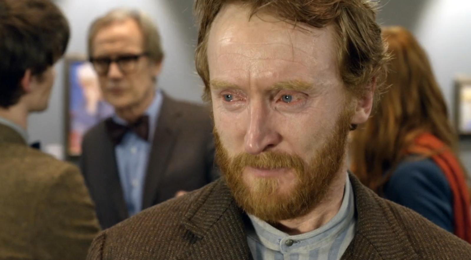
I am simultaneously writing this post and watching season  5 of Doctor Who (which, like, yes Matt Smith BUT I NEED DAVID TENNANT BACK), so just know I am going to reference Vincent and the Doctor approximately 145837 times in this post. 

And yes, that means what you think it means. Today we will me talking about none other than Vincent Willem van Gogh. Van Gogh was born in 1853. As per my last post, I'll give you a short history lesson. In 1853, the first ever potato chip was made, the first woman was ordained as a minister in the US, and Cincinnati, Ohio became the first US city to pay firefighters a regular salary. (Why yes, that is my hometown. You go, Cincinnati.)

Anyway, back to Van Gogh, he had a pretty difficult life. As a child, his parents got to frustrated with him that they sent him to boarding school. Unfortunately, he got kicked out because it didn't exactly improve him like they thought it would. So then he went and got himself a job as an art dealer. He wasn't bad at it, But he kept arguing with customers and he didn't like his coworkers so he quit. He went to school again, but he kept failing his exams. He became a minister in Borinage, which he was actually pretty good t. He cared so much for the coal miners in the community he lived with, that he was always giving them his stuff, even though he didn't have much for himself. Pretty decent thing of him to do, right? Yeah, well, it got him fired. Out of luck again. But we have now found ourselves at the point where he decided to become an artist. 

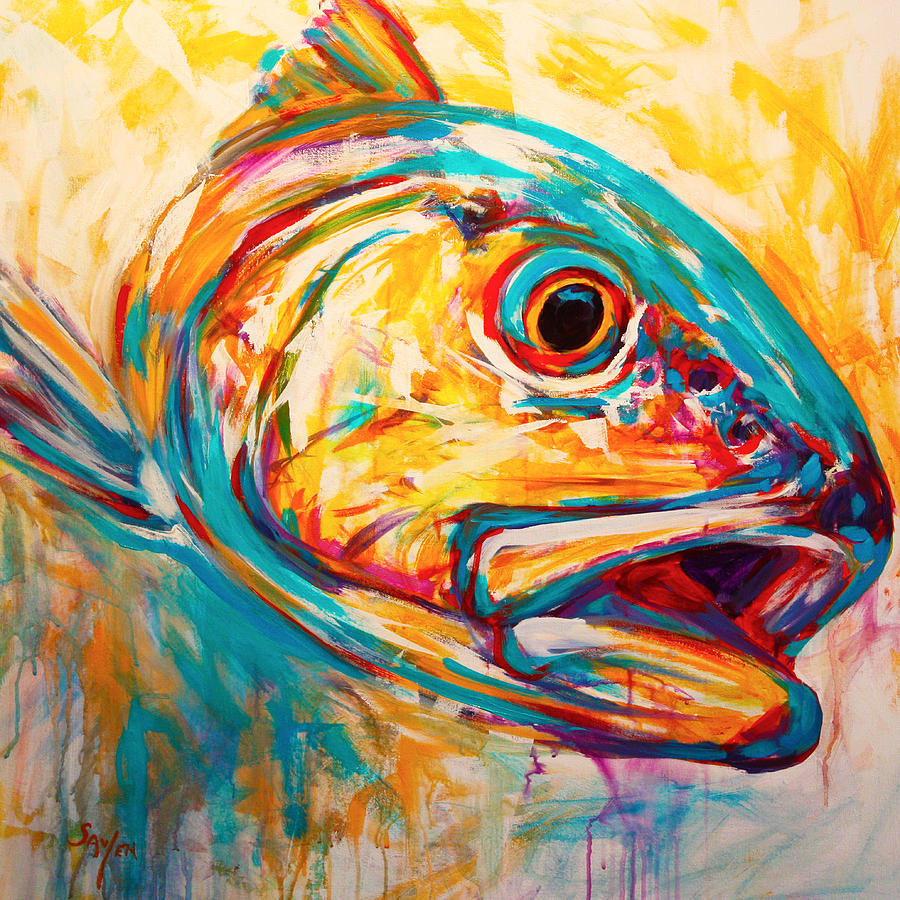
Last time, I talked about the raging war between the grumpy old Neoclassicists and the hipster Impressionists. Well, at this point, Impressionism was the big thing and it was leading into a form of art called Expressionism. Expressionists didn't want to display truth through their paintings, they wanted portray emotions. Goes with the whole patter of every other kind of art form. Stuff about God, to stuff about truth, to stuff about emotions. Next is stuff about fantasy and surrealism. So anyway, as an example of Expressionism, here is the painting "Redfish" by Mike Savlen.


[Quick note from Cailey: the original of this amazing painting is available for sale at Savlen Studios, so hop on over and check it out if you're interested and you've got some money burning a hole in your pocket! And no, the talented Mr. Savlen is not paying me to endorse his work, although as a broke college student, I wouldn't mind it! Okay, back to Lisa]

I suppose this fish is supposed to emote an emotion (does that even work as a sentence? You can tell I'm such a professional writer) but I can't really tell what it is. Blind panic, maybe? Or maybe he's having an existential crisis. You decide.

Getting back to Van Gogh, his later life was pretty much as miserable as his early life. He ws 27 when he decided he wanted to be a painter. During the 10 years he painting, he created over 1,000 works. His early works were in darker colors, depicting the normal lives of people, like this one called "The Potato Eaters".

Van Gogh the Potato Eaters

Later he started painting his more famous works, which used brighter colors and curved brushstrokes. Obviously his most famous painting was "Starry Night", which I'm not even going to bother showing you because literally everyone already knows what it looks like. Another one of is his famous ones is "Sunflowers" which of course we all know is actually inspired by Amy Pond.

Van Gogh Sunflowers

It is well known that Van Gogh was mentally unstable for most of his life. What his exact illness was, we're not exactly sure. Some claim depression, others claim epilepsy, still others say he got lead poisoning from all the lead paint he was using. He was very close with his brother, Theo; he even lived with him fore a while, but Vincent's mood swings made their relationship very strained. Still, he needed to maintain their relationship since Theo sent him most of the money he used to buy paint supplies, and he didn't have nay to spare. Sometimes he even skipped meals in order to spend more money on paint. To paraphrase what Ron Weasley once said, "He needs to sort out his priorities."

Ten years after he started being a full-time artist, he shot himself. I read somewhere once that he killed himself by drinking yellow paint, because yellow was a happy color and he wanted that happiness inside him. Although I half-hoped this was true, I'm sure I knew somewhere in me that it couldn't possibly. That type of tragically romantic stuff doesn't really happen, let's be real here. Van Gogh was crazy, but he wasn't dumb. Some people say he did ingest paint, but I haven't been able to find out if it was actually true or not. Whichever way you spin it, Van Gogh had a pretty depressing life. Even with all his hard work, he only sold one painting in his lifetime.

Yet, while hard lives are pretty terrible while they're being lived, when they're over they make pefect fodder for tragic stories and don't we all love those. Van Gogh became the poster boy for tortured artists. It wasn't until after his death that people started appreciating his art, and now his paintings sell for over 50 MILLION dollars.

I probably haven't told you anything you didn't know in this post. But I learned a bunch, so I think it was worth it. I'm going to go watch "Vincent and the Doctor" now and cry for a while.

Doctor Who Vincent and the Doctor

Thank you so much, Lisa, for bringing another great story of an artist to all of us here at See Cailey Color! 

Van Gogh is one of the many artists I mentioned in my last post. Though it's not clear what mental illness or illnesses he had, it is clear that it was a great struggle for him. If you want to learn more about mental illness and artists, go check out the National Alliance on Mental Illness and this article on Mental Illness and Creativity. If you're battling depression and suicidal thoughts, please check out the Suicide Prevention Lifeline. Van Gogh was gone too soon, and we don't want to lose you, too! 


Doctor Who quote Van Gogh Sunflowers

What do you think about Vincent van Gogh? Which of his paintings is your favorite? Share it in the comments!
-Cailey


Sources:
"Vincent Van Gogh (1853-1890)" The Department of European Paintings in associated wth the Metropolitan Museum of Art.

Van Gogh by Shelley Swanson Sateren